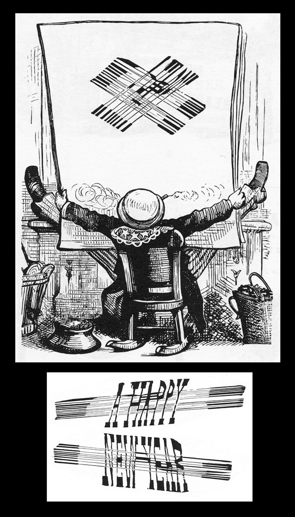
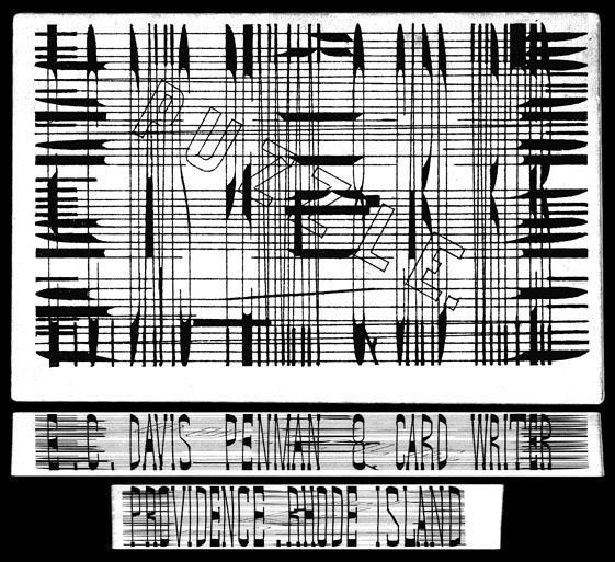
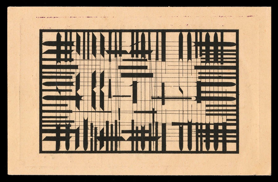
There are a number of quite different things labeled "anamorphic", including a cinematic technique and a photographic projection format and a form of geological metamorphosis and a functional programming concept and arthropod abdominal segments. Will Shortz assures me that the interesting type distortions shown here are known as anamorphic writing, and I believe him. He always knows what he is talking about. The idea of these "puzzle" cards is that in order to read the hidden messages, one must tilt the card to look almost flat across the surface. At that angle, the radically stretched type becomes reasonably normal, and readable. It's much like "STOP" or "YIELD" words painted on a street, or the dashed lines down the middle of the road: from a car seat, they appear quite normal (in the case of the dashed lines, quite short). But on the ground, the words are actually tremendously stretched out, and the dashed lines are mandated to be at least ten feet long.


Advertising trade card for The Suburban Home School of New Haven, CT, a boarding school founded in 1853,
run by Reverend Alonzo G. Shears. ( Collection of Jonathan Bulkley )

The first example I've seen of an anamorphic construction used for the corner card of a company.
This one reads "J. W. Merrill / Lumber Dealer”.

 This contains "Cupid's Mysterious Letter", a flowery Victorian heartfelt tribute:
"But to my bosom thou art dear, more dear
than words can tell and if a fault
be cherished there to love thee too well.
Art thou not dear unto my heart
Oh I search that heart and see
and from my bosom tear the part
that beats not true to thee.